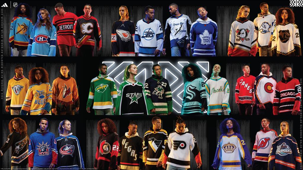
Anaheim Ducks (Pass)
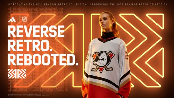
God dammit they did it again. The last tie around the ducks revived the worst jersey in the history of hockey for a victory lap. This time they take the classic Might Ducks jersey and brand it with their current color schemes. Please just make these your normal road jerseys. Pay Disney whatever they want to use the logo already.
Arizona Coyotes (Pass)
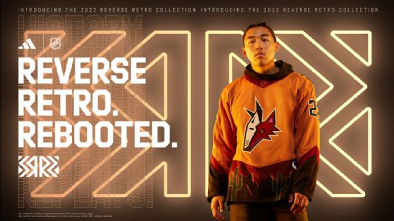
A franchise that needs something to cheer about and this is it! Yes, it is the same jersey just in gold instead of purple but it’s sick and it will sell like hotcakes so they can pay that boi, Clayton Keller.
Boston Bruins (Pass)

The bear head is one of the most widely loved jerseys in NHL history. Good to see it back, now sign Joe Thorton, win him a cup, and make everything right again. K Thanks!
Buffalo Sabers (Pass)

The Sabers suck but damn do they look good in their sweaters. This is the old Red and Black Dominik Hasek jerseys but in the traditional blue and gold color scheme with a revitalized Buffalo head. I don’t know any hockey fan who hates Buffalo or these sweaters so happy to see them again. However a future warning it is not cool to bring Buffa-Slug back ok don’t do it.
Calgary Flames (Pass)
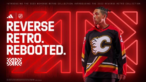
This takes me back to the days when Jerome Iginla would score a hat trick and then beat the wheels off your team’s tuff guy. It’s a pass for me but when your first reverse retro is the fire horse logo there is only so much you can do for a follow-up.
Carolina Hurricanes (Fail)

I feel like Carolina is running out of ideas for their jerseys. It’s fine but I’m sure they really had to fight the urge to just do a Black and Red Whalers jersey.
Chicago Blackhawks (Fail)
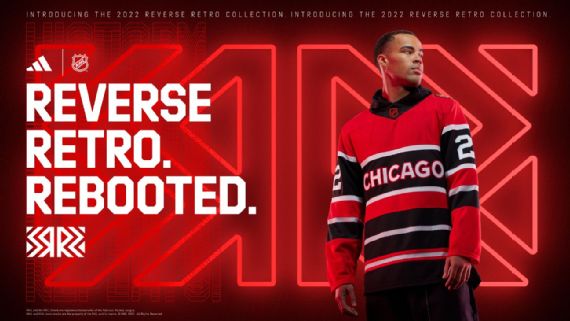
Detroit can I copy your homework? Yeah sure just change it a little bit so no one notices.
Colorado Avalanche (Fail)

Look as someone who spends a lot of time in the state of Colorado I’m not surprised to see the fart-sniffing greenies jerk themselves off. But at this point, the Avs should have just opted out unless Adidas just let them write across their chest “we’re the best fucking team in the league again so fuck off”.
Columbus Bluejackets (Fail)
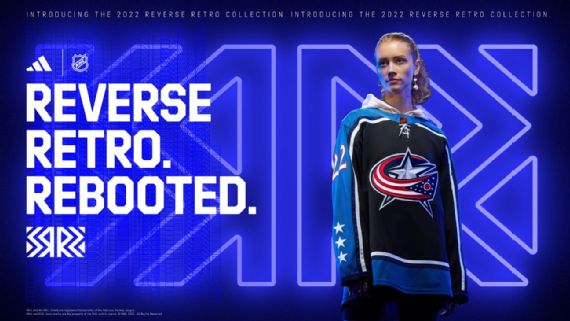
When Columbus first entered the league they had some sick threads and a sicker logo. They borrowed the thread’s layout and skipped the logo. LAME!
Dallas Stars (Pass)
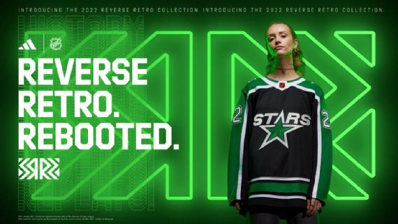
Is it great? No. Is it good enough? Yep.
Detroit Red Wings (Fail)
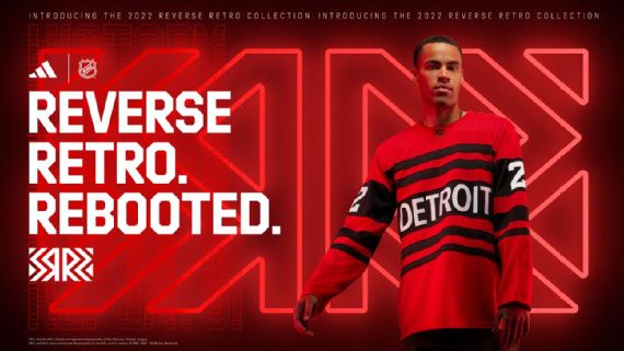
Chicago can I copy your homework? Yeah sure just change it a little bit so no one notices.
Edmonton Oilers (Pass)
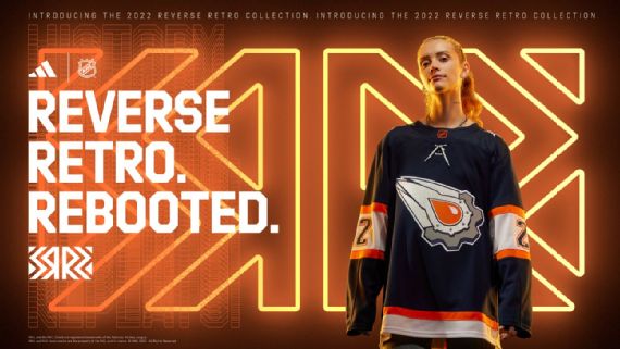
The Space Rock has returned and by god it’s glorious. With the 2000’s color way and with a team that finally feels like they can make a deep run in the playoffs these jerseys have some swag to them. Can wait to see Connor McDavid torch all five guys on an opposing team in these, gods they are great.
Florida Panther (Pass)
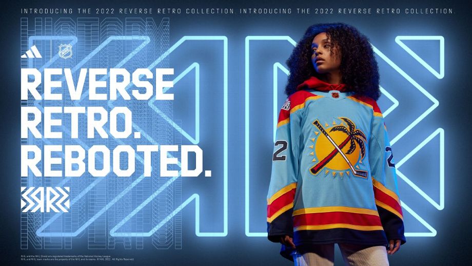
Florida won the whole fucking thing again.
Los Angeles Kings (Pass)
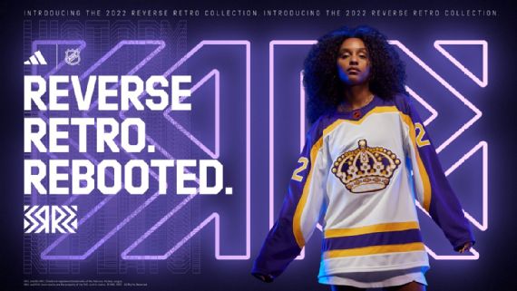
Last time around LA nailed it and this time is no different. They continue to blend old logos and colorways with modern piping that truly is beautiful to see.
Minnesota Wild (Fail)
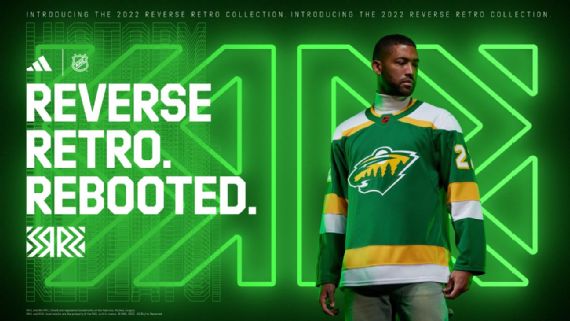
Hey, dumb ass you said it was great when Phoniex did the same jersey but in a different color. Yeah, and it was but Minnesota has so many better options to go to that don’t feel like a desperate attempt to reclaim their history from Dallas.
Montreal Canadians (Pass)
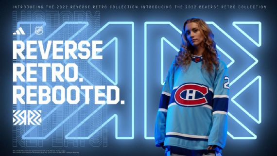
Most of the original six teams will always have a hard time with this assignment. Because they don’t change their colors, logos, and jersey layouts often. So for Montreal to have a good jersey is even more impressive than say the Ducks.
Nashville Predators (Fail)
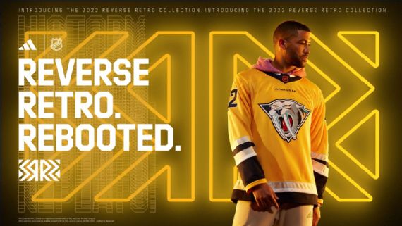
They got the right jersey the right logo wrong fucking colorway. Make that thing Royal Blue at the base and we got something. Essentially it is the same jersey but a slightly different gold color.
New Jersey Devils (Pass)

Hey, what if we did our regular jerseys but added blue and yellow for no reason. Well, it can’t be worse than the Jersey sweaters that just say Jersey on them. Actually, the blue and yellow addition is a nod to how the franchise was moved from Colorado to New Jersey in the 80’s soooooo. Fair point play on.
New York Islanders (Pass)
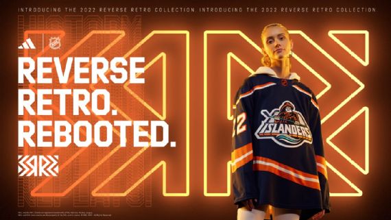
Standing ovation please for the Islander’s welcome back Gordon Fisherman Logo its been too long!
New York Rangers (Pass)
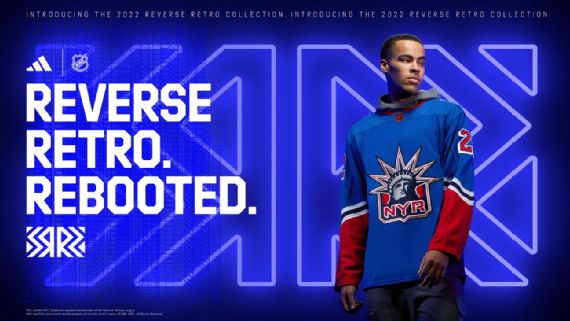
My Ranger friends seem split on this one. The return of Lady Liberty is a plus but the jersey otherwise leaves something to be desired. But I’m here for the return of all 90’s logos so I will take it.
Ottawa (Fail)
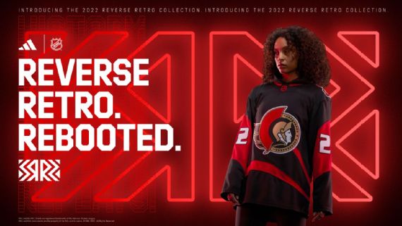
I don’t want to fail the Sens here but not much else they can do. They already brought back this logo and returned to their old jersey layout so what are ya gonna do? Guess you could have gone back to the horizontal strips with the O logo.
Philadelphia Flyers (Fail)
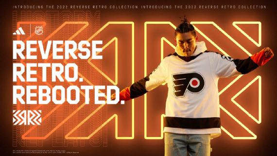
Hey look a dumpster!
Pittsburgh Penguins (Pass)
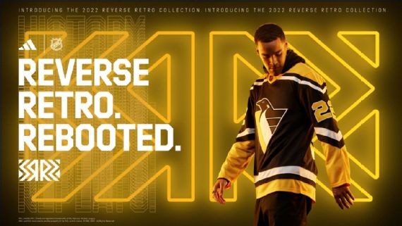
Well well well, fancy seeing you after all these years. You look amazing like you haven’t aged a day since last I saw you. Do I still have feelings for you aks? To be honest with you, I never stopped loving you. (Then a passionate embrace)
San Jose Sahrks (Pass)
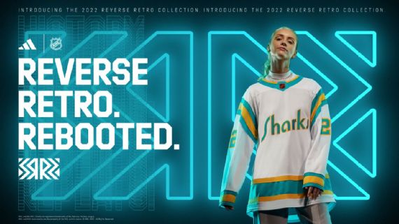
You Checky Bastards! San Jose may not be a good hockey team right now, but they still know hockey and they still have the sickest closet in the NHL. The throwback to the old bay team the California Golden Seals is really awesome to see. The word Sharks in that iconic script font while seamlessly blending the Shark’s teal with the Seal’s gold is awesome to see.
Seattle Krakren (Pass)
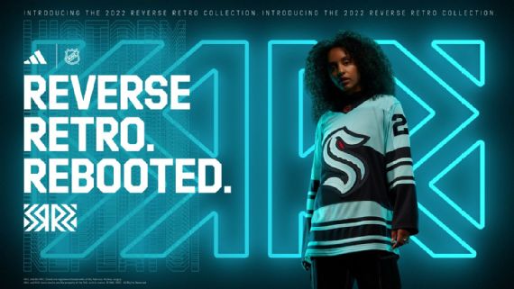
It’s a cool enough jersey so it’s a pass. But hard for the Kraken to do much in their second season.
St. Louis Blues (Pass)

Well fucking alright then St. Louise you didn’t have to go that hard! These are really cool. I have no idea what they are based on but they look awesome.
Tampa Bay Lightning (Pass)
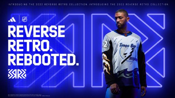
You know when something is so bad it’s good? Please see example A. This is a roller hockey jersey returned from the grave for one last ride. My guess is when Adidas pitched the idea of the Reverse Retros they were holding pictures of the 5 worst NHL jerseys in history. They showed them to the teams and were like who wants to go first. Last year Anaheim took the bullet with pride and this year was Tampa’s turn.
Toronto Maple Leafs (Pass)
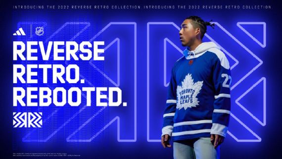
As we talked about before it’s hard for the original six teams. For the most part have always had the same colors, logo, and jersey patterns. This is fine. I would like to see next time the Leafs go wild and have an all-pink jersey or something crazy.
Vancouver Canucks (Pass)

Last year they brought back the flying skate with their alternates. This year they give Johnny Canuck his time to shine. Hockey nerds around the world are drooling over this, I also love the return of the jersey number on the front.
Vegas Golden Knights (Pass)

Look Vegas last time rocked this assignment. This time they played it safe but smart. Diagonal lettering on jerseys is unique to hockey and Vegas took their swing at it. I wish it said Las vegas, but otherize this is sharp.
Washington Capitals (Pass)

ABOUT FUCKING TIME! I can’t believe we got this close to letting Ovi retire before they brought back the sweaters he made his debut in. These are downright nasty and now blacked out I bet Ovi has a hatty in his first game in these.
Winnipeg Jets (Pass)
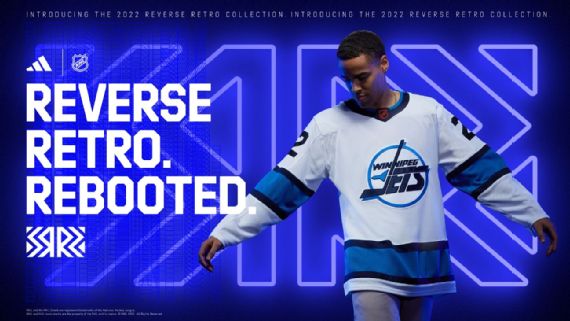
Good enough for government work. The Jets do what the Wild fail to do. They honor their history without seeming desperate to reclaim it. Next time if I could be so bold I would do a full-blown white-out jersey. The inverters of the now-overplayed playoff phenomenon deserve a jersey that is all white with white pants and white socks and white gloves.
So in conclusion Adidas goes 23/32 leaving them at a cool 71%. Honestly, I do look forward to these when they do them and think it is something the NHL should continue with. Also, the side note looks like the Penguin’s plane to wear the diagonals or reverse retro <a rel="noreferrer noopener" href="http://<blockquote class="twitter-tweet"><p lang="en" dir="ltr">REVERSE RETRO JERSEYS ARE AVAILABLE FOR PRE-SALE NOW!<br><br>Full details and schedule: <a href="https://t.co/BOcDvytUnJ">https://t.co/BOcDvytUnJ</a> <a href="https://t.co/4Onc2Nsri9">pic.twitter.com/4Onc2Nsri9</a></p>— Pittsburgh Penguins (@penguins) <a href="https://twitter.com/penguins/status/1583126142386864128?ref_src=twsrc%5Etfw">October 20, 2022</a></blockquote> <script async src="https://platform.twitter.com/widgets.js" charset="utf-8">15 times at home. The tweet says <a rel="noreferrer noopener" href="http://<blockquote class="twitter-tweet"><p lang="en" dir="ltr">1992 would be proud 🤩<br><br>Get your <a href="https://twitter.com/hashtag/reverseretro?src=hash&ref_src=twsrc%5Etfw">#reverseretro</a> on 11.15.<a href="https://twitter.com/hashtag/LetsGoPens?src=hash&ref_src=twsrc%5Etfw">#LetsGoPens</a> x <a href="https://twitter.com/adidashockey?ref_src=twsrc%5Etfw">@adidashockey</a> <a href="https://t.co/lvO3waW79R">pic.twitter.com/lvO3waW79R</a></p>— Pittsburgh Penguins (@penguins) <a href="https://twitter.com/penguins/status/1583118633257304064?ref_src=twsrc%5Etfw">October 20, 2022</a></blockquote> <script async src="https://platform.twitter.com/widgets.js" charset="utf-8">92 would be proud. . . Apparently, that means this team will be a juggernaut all year long and then to the Islanders in heartbreaking fashion.
