
Adidas and the NHL released the official 4th jerseys for every NHL team this year. The concept was to take a retro jersey from the team’s history and invert the color scheme. Cool idea the results were mixed. So we will break this down using the title of a movie that is like these jerseys, The Good The Bad, and The Ugly.
The Bad – This is the ahh its fine jerseys.
Dallas Stars

If you are a roller hockey guy you’re loving these right now. The classic oversized star piping (which I like) but then a lot of white and silver. Look anything on Tyler Segan will look good, but after the Stars awesome Winter Classic jerseys I had hoped for more.
Ottawa Senators

This is like too much birthday for the Sens. They already switched back to the coin head Senators logo and adding just another weird color rush esc jersey didn’t do it for me. Would have rather seen them experiment with the candy cane jerseys the Sens originally wore when they were founded.
New York Rangers
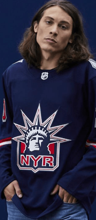
Love the Statue of Liberty head, makes me think of a time where the Rangers had a bunch of aging veterans who were great in the first half of the season and then would fall asleep mid season and limb into the playoffs. The arm piping is very 90’s and goofy, but over all just whatever.
Edmonton Oilers
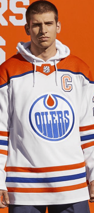
I wish they would have used the oil drop era. Those jerseys were sick, this just looks like it could be a normal jersey for them.
Vancouver Canucks

Ok so this is like a take on what the Los Angeles Rams are doing this year, but honestly Adidas why no flying skate logo? I know those are their thirds but come on man it’s not that hard.
Columbus Blue Jackets
That is a lot of red, and the piping is weird, but to be fair to Adidas and Columbus, they entered the league at the beginning of the Rebook era (throws up in trash can) and really don’t have a jersey to jump back to.
Minnesota Wild

This is like the opposite of what they did for the Jets. It’s a North Stars jersey with a wild logo. Cool, whatever. I feel bad for Minnesota, they should have never lost their franchise and now they have this bastardized history that creates half hearted jerseys like this.
Montreal Canadians
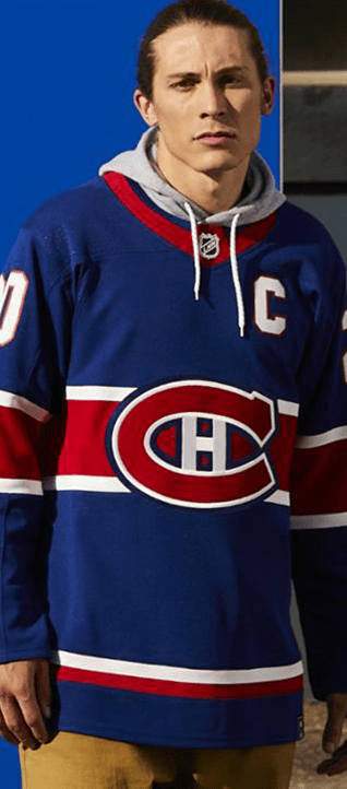
I think some of the Original six teams were always going to look weird, but like wow, this is weird. The Canadiens have NEVER worn blue as their main color. So the jersey looks great (like it always does) but that logo on blue freaks me out.
Ok now the Ugly.
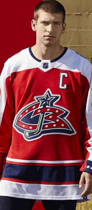
Washington Capitals

This is what every Caps fan wanted, but in the wrong colors. The Navy and Vegas gold Caps were sick. Jagr, Kolzig, Gonchar, Oats, Bondra. They were the bad boys of the NHL dirty, physical, high powered. Could have done a complete throwback to that.
Winnipeg Jets
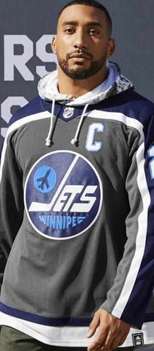
Im so sorry Jets fans, I swear to the hockey gods that the NHL hates you. That is the ugliest color scheme for one of the best jerseys in hockey history. I’m pissed off for you.
New York Islanders

Where the fuck is the Gorton’s Fisherman logo? Someone explain this shit to me? Jesus, someone get me in touch with Adidas.
Toronto Maple Leafs
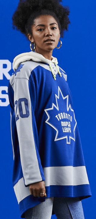
Like the Canadians you just can’t fuck with the Leafs man. And the Leafs have such a history of bad jerseys on their own they don’t need Adidas helping them. The arm length piping just feels weird. Especially when the Leaf’s are known for their awesome piping.
Detroit Red Wings

The Black Hawks have the best jersey in hockey, but the wings aren’t far behind them. That is till this abomination graced their shelves. Did Stevie Y approve this? Is using grey the lame idea they had for teams who need a third color? No clue it sucks.
The Anaheim Ducks

YOU HAD ONE FUCKING JOB ADIDAS AND YOU BLEW IT!
Now for the Good, which to be fair I have liked a lot of what Adidas has done in their era, and a few of these they blew me away with.
Colorado Avalanche

What you didn’t do for the Ducks you did for the Avs. This is fucking perfect. Nathan MacKinnon will somehow look faster in these jerseys.
Chicago Blackhawks
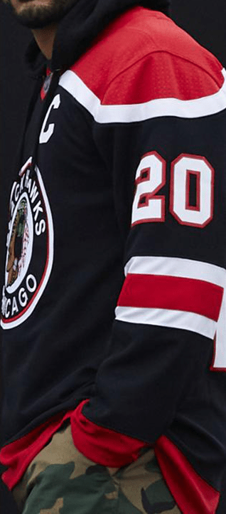
Shut up and take my money.
St. Louis Blues
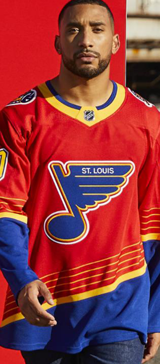
The return of the red diagonal cut is my everything. These should become the new third jerseys for the Blues.
Boston Bruins

The only original six team they nailed. Except Chicago but its hard to mess that up. This is Bruins through and through, plus when Marchand makes someone bleed it will show up well on these jerseys.
Arizona Coyotes
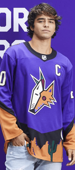
When the Yotes moved from Winnipeg the team had to separate themselves from all of hockey. They wanted to stand out and embrace the idea of hockey in the desert. This jersey harkens back to that idea. Super untraditional piping, just using the Kachina head, the desert mountains and cactus accent at the bottom. God this is great and I can’t wait to see Raanta’s pads with these jerseys.
New Jersey Devils
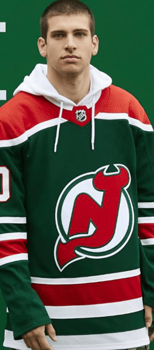
Fucking Rights Boy, the Christmas tree Devils are awesome and this just screams Ho Ho Ho to me. The Devil’s have a top 10 logo in the NHL and now a jersey that sings for it.
Calgary Flames
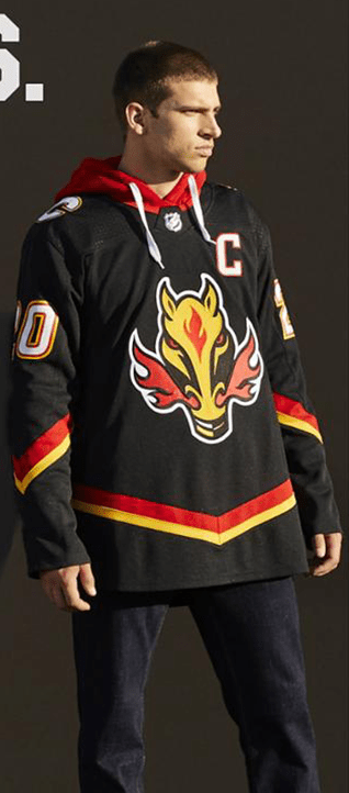
Iggy must be so happy, the horse head was a forgotten era in Flames history because they sucked. But then when third jerseys became a thing they toyed with that logo on the sleeves. Now to see it back on the front of a jersey where it belongs is fucking epic.
Philadelphia Flyers

Look the Flyers jerseys are hit or miss. But these work for me, and if they wore the Roller Hockey pants with them I would rally applaud them. The piping is weird but the flyer never looks good in traditional piping anyway so this works for me. They also didn’t do what the Jets and Leafs did. They broke up the piping down the arm, that makes it more unique and less blocky.
Vegas Golden Knights

I thought the third jersey was cool then Adidas said hold my beer. The alternate logo is sick, and Vegas is going to be so good this year I can’t wait to watch these jerseys dummy the Sharks in the first round of the playoffs.
Carolina Hurricanes/Hartford Whalers

The Canes embarrassing the Whalers past has been my favorite things to happen in the past few years. A bunch of jerks wearing arguably the best logo ever, and some of the best jerseys ever. Then to do the gray out jersey. I know I said it was dumb in the past, but those jerseys were predominantly white. This is an all gray jersey. A very popular trend in College hockey, Robert Morris and Penn State being a few to do it well. These are sick.
Los Angeles Kings
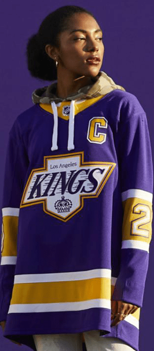
As a newly made LA man this jersey speaks to me. The Kings classic Purple and gold using the classic Kings logo that is not associated with this color scheme. The numbers on the elbow inside the piping is really different. It’s very Lakers, it’s very royal, it’s so LA.
Tampa Bay Lightning

They returned to the summit of hockey this season, and now to have a throwback to celebrate that. The Lightning are one of the best expansion teams in league history and this jersey feels like it honors their achievement. Taking the jersey print from the first cup, and updating to current colors. If I was a Boltz fan this would be a must have.
Nashville Predators

The return of the old school logo, with the bright yellow and original piping is very cool. I would love to know what my buddy Brooks Bratten thinks of his Preds new threads, but I like it.
Buffalo Sabers

Look the Sabers have the an elite color scheme and logo catalog. They also have the most skeletons in their closet as far as bad jerseys. Exhibit A Buffa Slug, but this works the enlarged sabers with the circle logo is sweet. They have all the old school bevel, emboss, and accents the Sabers are known for. Plus the re-emergence of the buffalo head on the shoulder. This makes me so happy. The one thing I’m not sure if I love is Buffalo on the bottom piping, but I think it will work, because Buffalo can’t ever be perfect.
2nd Best – San Jose Sharks
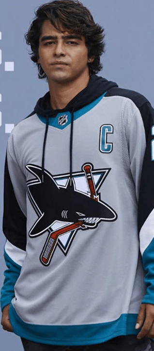
Wholly Shit Ryan Vojtash is in love with this. Original 90’s piping, the return of the gray jersey, the classic logo. This is just so perfect and honestly if my favorite didn’t have sentimental value this would be the winner.
The Best – Florida Panthers

I am unapologetically a fan of the Florida Panthers jerseys and goalies. This jersey is everything, it’s the logo that Beezer and Bobby Lou wore. The color invert works so well here. I have the red jersey, and it’s one of my all time favorites, and this one is even cooler. A must buy for my collection.
Oh wait, I forgot one . . . Perhaps this was so you would scroll the entire way through the article, or perhaps this was saved for last because of how terrible it is.
The Worst Pittsburgh Penguins
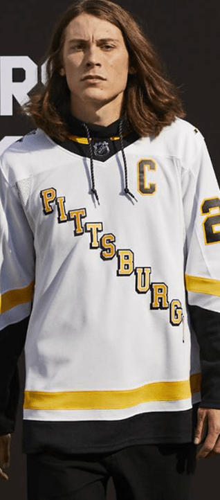
My god these are bad. It’s like Adidas knew what we wanted and half assed it. It’s like Mario himself didn’t want this so he made them bad on purpose. These are such a bastardising of everything that is holly about the 90s penguins I can’t stand it.
First, never EVER put yellow text on white it looks like trash.
Second, why is the pigeon penguin not on the shoulder?
Third, and I really want you to listen to me. THAT IS NOT THE CORRECT PIPING! THE DIAGONAL JERSEY SHOULD HAVE THREE RINGED PIPING NOT THE DIAGONAL SLAT PIPING FroM THE SHITTY REEBOK JERSEYS AHHHHHHHHH!!!!!!!!!!!!!!!!
Allow me to further explain the piping problem. The original piping was lower on the cuff, so the diagonal Pittsburgh pointed to the cuff of the jersey. This piping is too high and does not allow your eye to complete the journey down the lettering. Yikes!
Also why are the numbers black? The original jersey had yellow letter diagolay and yellow numbers. If you decide to start with a yellow letter you have to finnish it with yellow numbers. Or did someone say something like, “you can’t make the numbers that color it’s too hard to see them”. I bet they did and I bet that’s why they changed them, so they should have made the diagonal Pittsburgh to black as well.
Finally this jersey was pretty simple to re-do. Just take the white pigeon penguin jersey and make it black. Do I have to do everything? Jesus Adidas.
All and all a lot of good, but the Ducks, Islanders, and Penguins feel like giant missed opportunities. Again I like a lot of them and the bad ones are just fine. But come on man this is the Ducks jersey we all wanted.

