As I was watching the “Idiot Hour” presented by Thoughts From the Bench yesterday, the guys talked about their favorite sports jerseys of all time. Their draft got me thinking of all the jerseys I have seen throughout my lifetime, some good and some awful. The episode inspired me to come up with a list of my best and worst hockey jerseys over the years.
Best of the Best
The Mighty Ducks of Anaheim (1995-2006)
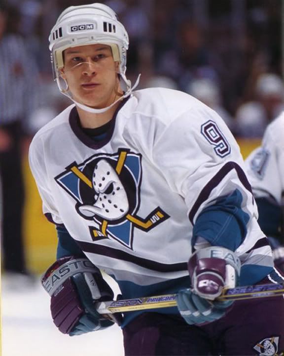
The Mighty Ducks jersey has to be part of your top jerseys solely cause of the nostalgia. The team itself was owned by Disney and gained popularity as a result movie series, The Mighty Ducks. The logo is simple yet sweet, with a duck wearing a goalie mask along with the two hockey sticks. The teal and purple color scheme was very unique, and separated them from other NHL teams.
Phoenix Coyotes (1997-2001)

The Winnipeg Jets moved to the desert and decided to incorporate the culture into their jersey designs. The Aztec look known as the Kachina jersey is fan favorite among hockey fans young and old. In fact, recently the now Arizona Coyotes, brought back the Kachina jersey as their new alternate jersey.
Quebec Nordiques (1991-1995)
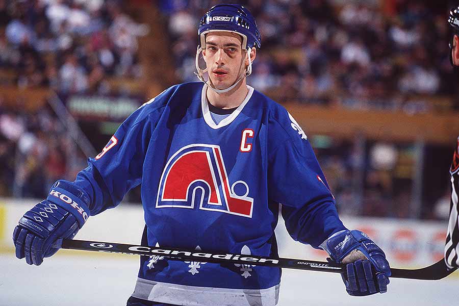
The Nordiques nickname translates to “People of The North” in the French language. Since Quebec is one of the most popular French Canadian cities, the nickname was perfect for the team. The red, blue, and white color scheme just looks so fresh, especially with the fleur-de-lis (flower lily) symbol on the shoulders and bottom of the jersey.
Pittsburgh Penguins (1992-1997)
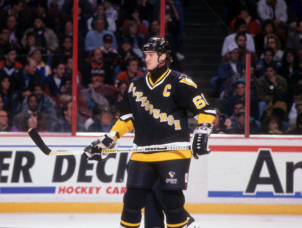
The Pittsburgh Penguins Diagonal jersey is a beaut. After winning back to back cups, the Penguins decided to update their logo and redesign jerseys. The front of the jersey looks similar to the first ever Penguins jerseys, which were light blue and white, and including the diagonal Pittsburgh text. Fans have been missing these jerseys for years. Now that the Penguins are back to their black and yellow color scheme, I don’t think it’ll be too long before we see these beauts make their return!
Hartford Whalers (1989-90)
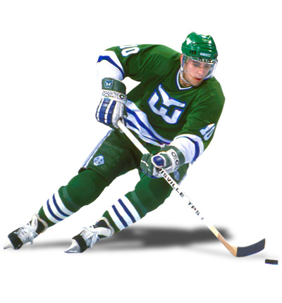
The Hartford Whalers logo is pretty awesome. Although the jersey is quite simple, it is the logo that stands out to me. The logo is composed of the letter “W” and a whale’s tail, simple enough right? Well, the more you look at the logo you’ll see that the negative space between the “W” and the tail create the shape of the letter “H”, which stands for Hartford. The team played their last game in Hartford in 1997, and then moved to Carolina to become the Carolina Hurricanes. However, the love for these jerseys continued on. In fact, the Carolina Hurricanes brought back the Whalers jersey for a throwback night in 2018.
The Worst of the Worst
New York Islanders (2011-2014)
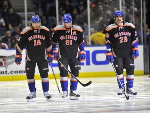
So I’m not really sure what the Islanders were thinking with these jerseys. Most teams do like having an all black third jersey or alternate, but this is just horrendous. The numbers on the front of the jersey is a good look for basketball uniforms, but in hockey it just looks weird. I think the jerseys would have looked a little better if the shoulders were also black instead of the gray, but thankfully these jerseys didn’t last too long.
Nashville Predators (2001-2007)

The Nashville Predators introduced an alternate jersey to the hockey world in the 2001-2002 season. Many people, including myself still have nightmares about these jerseys. The logo itself isn’t terrible, but the mustard yellow jerseys makes up for it. Just looking at these jerseys makes your eyes hurt.
Dallas Stars (2003-2006)

Growing up I was never really a Dallas Stars fan, mainly because they dominated the league. However, I was a fan of their jerseys until they introduced this alternate in the 2003-2004 season. The jersey added a little bit of orangish-red to their green, black, and gold color scheme. The alternate logo just had a lot going on in it, especially for a hockey logo. The logo was supposed to represent the Taurus constellation. However, many fans believed it looked more like a female’s reproductive system, earning the nickname the “Mooterus”. Big yikes, thankfully these only lasted a few seasons.
Anaheim Ducks (2007-2014)

Honestly ever since Disney sold the Ducks, things just haven’t been the same. The team changed their colors from teal and purple to black, gold, and orange. To this day, I’m still not a fan of their jerseys, but these ones were definitely one of the worst. The jersey and logo combo just seem boring to me, and there’s not much going on.
Los Angeles Kings (1995-1996)

In the 1995-1996 season the the LA Kings introduced these alternates to the world. The jersey kept true to the Kings purple and yellow color scheme while also including the black and gray color scheme. The logo on the chest makes you think that Burger King sponsored the team, it’s possible? Overall the jersey looks like a homemade inline jersey, and it only lasted one season. You hate to see it.

One thought on “Best/Worst NHL Jerseys”