
Wholly Shit, just when I thought they were starting to get it right the NHL has produced another crap-tastic jersey.

Continuing along with the trend of embracing the host city in the jersey design the NHL decided to put the logo of every team on a music scale. Which for those of you who don’t know a music scale are five lines on a piece of paper? When reading a piece of music, notes like the St. Louis Blues symbol are based along with it referencing pitch and duration of the sound. So if you are a St. Louis Blue you have a neat looking jersey.
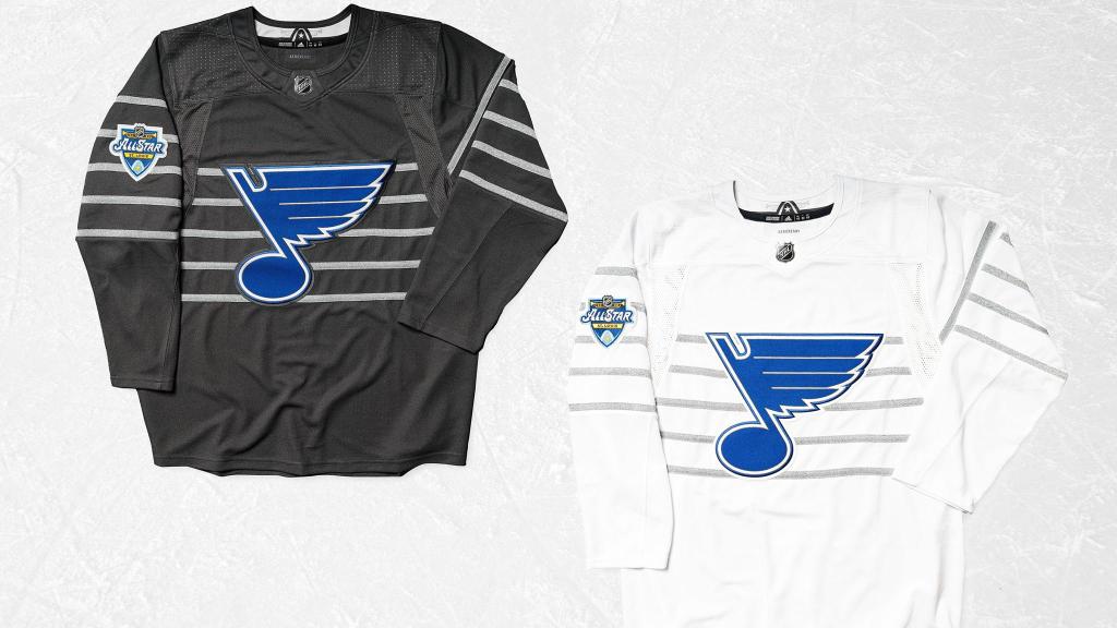
If you are any of the other thirty effing teams you look like a child drew a logo on a piece of paper in your primary color. Can someone explain to me exactly what tone a Jet makes when it is on a musical scale? Is it just a symbol for “Take My Breath Away”?
The NHL nailed the jerseys last year. They had the Sharks jersey print, blacked out the logos and everyone looked sharp.

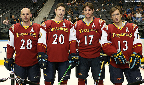
Lord only knows what genius came up with these jerseys. Look hockey jerseys are hard to design. And if you are not careful you can end up with the Atlanta Thrashers. This jersey has not slid that far down the scale, but it is not good either.
It’s fine though because in a month the Avalanche are going to wear these garbage bags and everyone will forget about it.
