The 2020 World Series Winners are the LA Dodgers. As I watched the postseason it became clear to me that not only did the Dodgers’ have the best offense in baseball, but perhaps the best hats in baseball. Whether you believe how cool your hat is matters or not, there is a saying that lends credence to the theory. “Look good, feel good, play good”, and the Dodgers have a history of looking good, and played good.
So I said to myself, “Josh, maybe you should rank every baseball hat in the current major league.” So, that’s exactly what I am going to do.
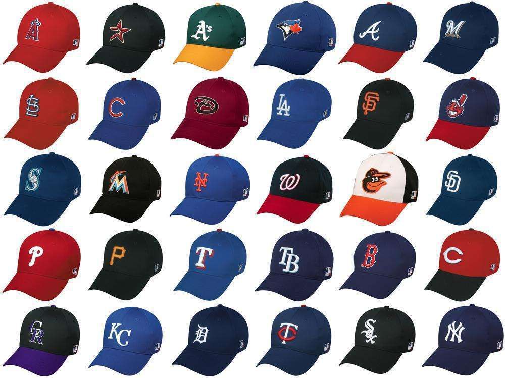
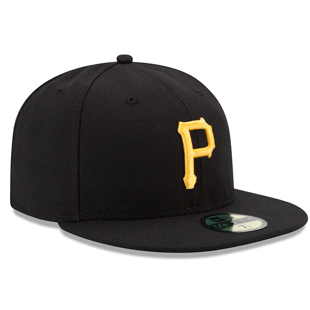
30 – Pittsburgh Pirates – The black hat with the P is blah. The pirates should only ever wear the 70’s bucket hats end of story.
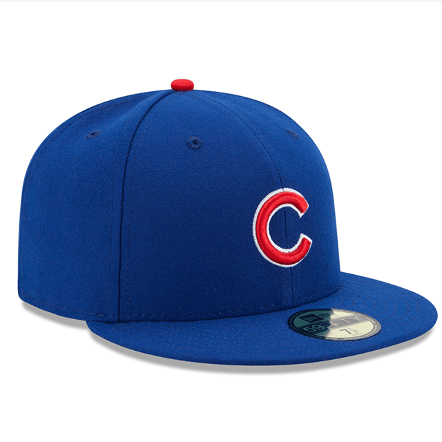
29 – Chicago Cubs – The Cubs have a variety of hats, but the Cubs blue with the Red C and white stroke is terrible. It fucking annoys me so much that is the hat they wear every day.
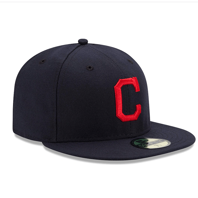
28 – Cleveland Indians – Ok cultural appropriation aside. That screaming Indian Head was perfect. Like the most iconic hat in baseball perfect, and they fucking threw it away. I understand and agree with why, but seriously that hat was awesome.
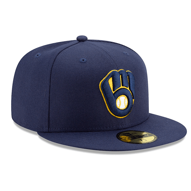
27 – Milwaukee Brewers – What am I looking at here? Like a weird hand with a ball in it? Like is this the Glove from Super Smash Brothers? I dont know its dumb. The M with the wheat stock was so much better.
26 – Washington Nationals – The next three hats are all red with a letter. They are all fine, but like whatever, first up The Nationals. Who cares next

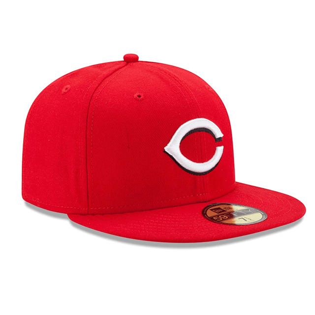
25 – Cincinnati Reds – Ok you smushed the C, cool.
24 – Philadelphia Phillies – Alright its a P, you know what other sports franchise has a shitty P as their logo? The Flyers.

23 – Houston Astros – The Astros have taken some risks with their head gear over the years, and this one is the most plain of them all. Who cares, next.

22 – Kansas City Royals – This hat is clean, it has the two letter system baseball is famous for. It’s nothing special but it’s pretty and I like that.

21 – Baltimore Orioles – Ok the Classic Orange O on black is perfect, but I appreciate the two tone color and using the mascot so I’ll give them a higher spot then I normally would.

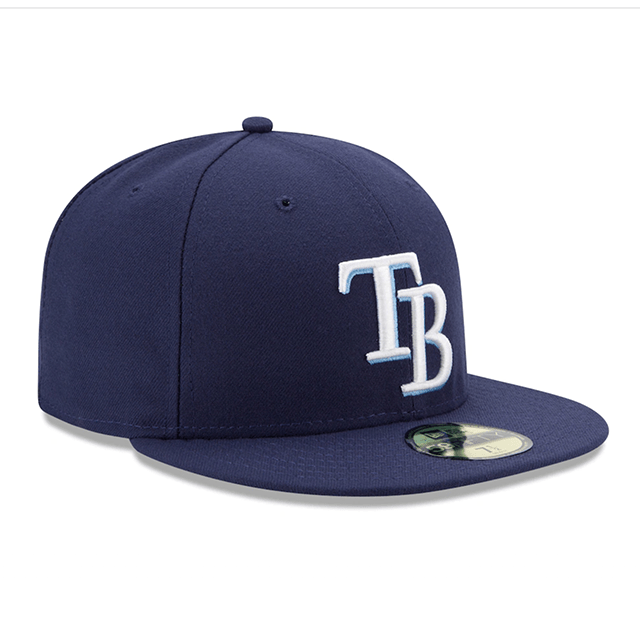
20 – Tampa Bay Rays – Look, the Rays hat is fine. It has a nice double letter structure that they borrowed for the Dodgers. I like the baby blue streaks in it, but look. The old hat had a mother fucking sting ray swooping in to wreck your mother fucking soul in bright 90’s neon Purple and yellow.
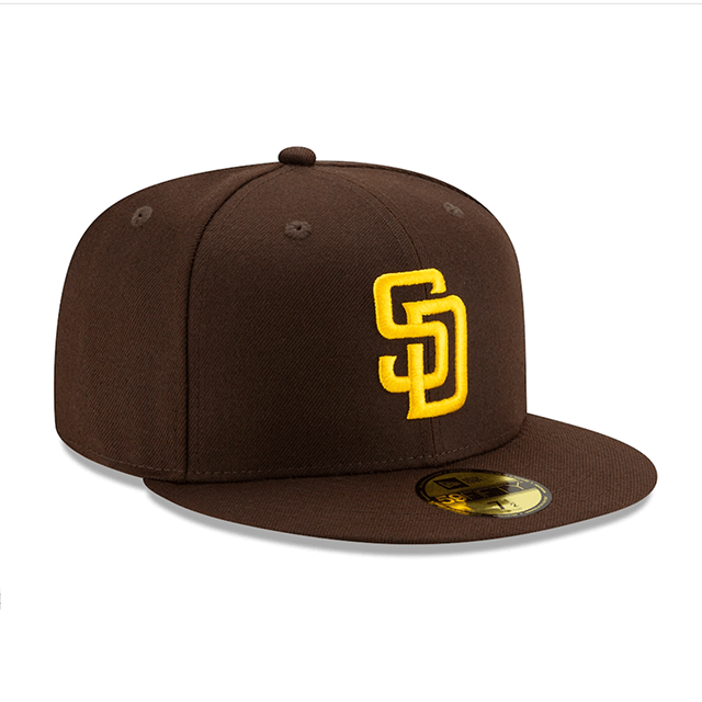
19 – San Diego Padres – The hat is fucking brown. Thats cool. End of story.
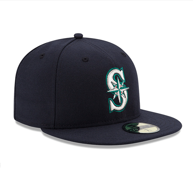
18 – Seattle Mariners – The S is cool but the logo makes no sense, is it a compass, is it the north star? Who knows? Not even Ichiro can make this hat cool.
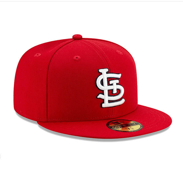
17 – St. Louis Cardinals – The first 3 letter hat to make the list. And honestly just the most confusing hat in the Big Leagues. Like what are you trying to convey here? No clue, plus the Cardinal on the hat is so much better.
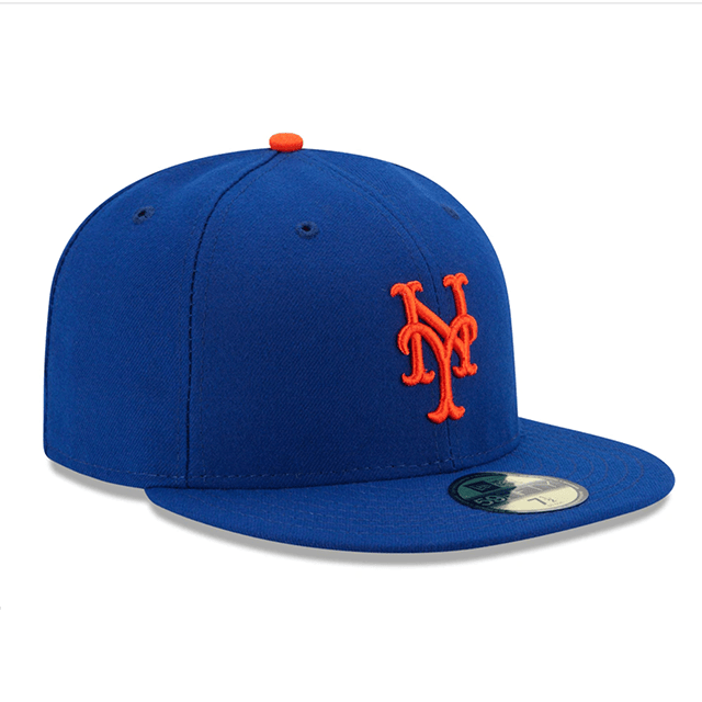
16 – New York Mets – The colors are awesome, and they match the red headed step child hockey team of New York. The hat stands out in New York if you are one of the self hating people who choses to root for the Mets. Personally all I can see is Daniel Murphy smashing home runs in 2015 essentially burying the Cubs alive. The hat isn’t higher because the two letter entanglement is sloppy. Honestly it’s just weak, and when you’re stacked up against the Yankees it’s just ugly.
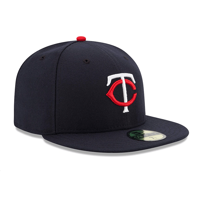
15 – Minnesota Twins – The Two letters intertwined is a classic look in baseball. The Twins are the only team where the letters are different colors. This is a cool ideal but the entanglement of the letters is pretty basic.
14 – Boston Red Sox – This is the barrier for entry for a cool hat. Every Bostonian has one, and it’s kinda cool with a fancy B and a white outline. But here is the sich, this aint the best hat in Boston’s roster. The pair of Socks is way cooler. So it has to be this low on the list.

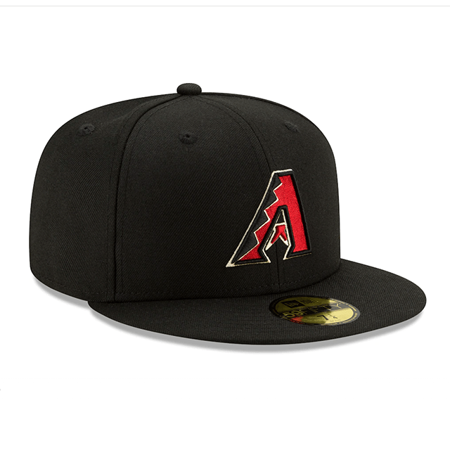
13 – Arizona Diamondbacks – Look this hat would rocket to the top 3, but the current color scheme isn’t as appealing as the 90s version. But the A with the snake print is fucking cool.
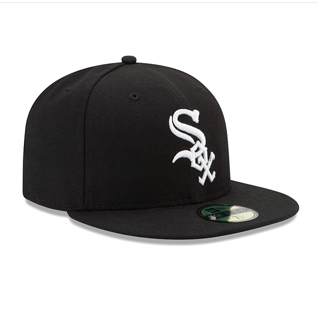
12 – Chicago White Sox – Black and white will never go out of style. Example: the Raiders. Raiders gear is always cool and the Sox logo has the same qualities to it. It has 3 letters which is rare and the diagonal letter feels like a hockey thing which is cool.
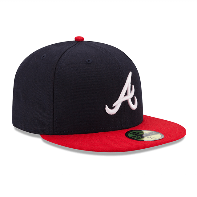
11 – Atlanta Braves – That A is so perfect. The cursive letter is just so smooth and classy. The two tone hat is great and with the Red and Navy color scheme you can never go wrong. It has been the cap for a number iconic players and teams. It also is just one of the cleaner looks in the game.
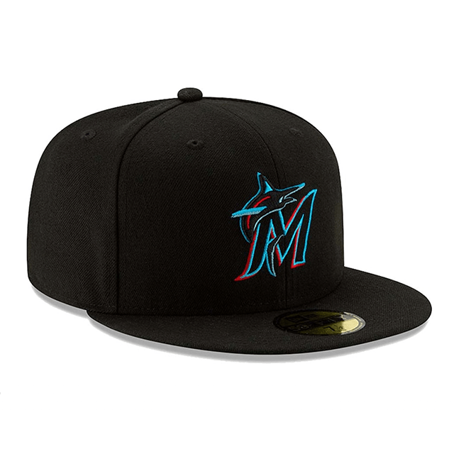
10 – Miami Marlins – Look, the old Florida Marlins hat had better colors but this hat is better designed. Plus if you like a nightclub on crack feel the Marlins hat is perfect. No matter what era of the Marlins logo you look at it’s probably one of the coolest in sports. That’s what separates this hat from the others. Plus it’s one of the only hats that has a mascot and a letter.
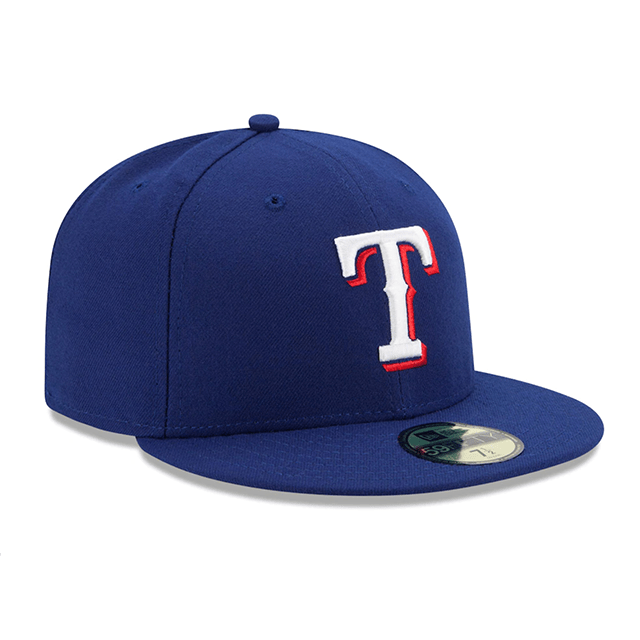
09 – Texas Rangers – So this is improving on the Boston Red Sox’s or Chicago Cubs, but getting rid of the white stroke and switching it with a bright red drop shadow. Plus blue white and red is just a classy sports color pallet.
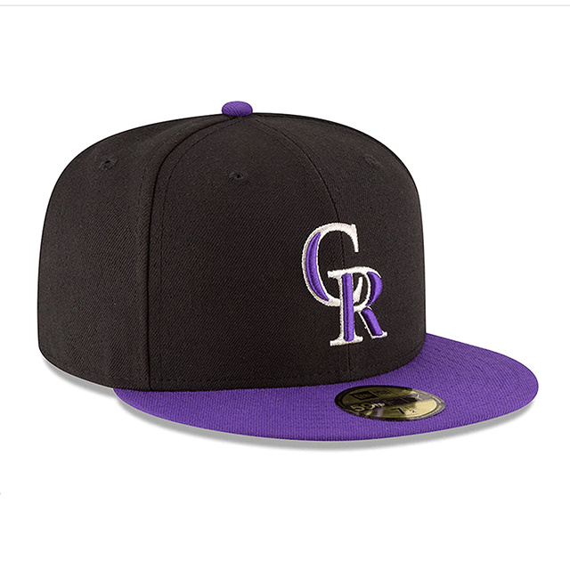
08 – Colorado Rockies – There is a hat in this list that will improve upon this concept later, but the Rockies introduce a good starting place. The only thing I’m not crazy about is the letters. They are kind of messy with the two tone letters. But the purple and black is rarely seen in sports and makes it stand out.
07 – Detroit Tigers – The D is the only cool thing about this hat, but it’s a really cool fucking D. Its like that S we all made in Junior High but actually done by a calligrapher.

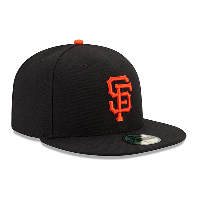
06 – San Francisco Giants – Look this hat belongs in the top 5. But unfortunately there are only 5 spots in the top 5. Halloween colors, the S and F stand out and blend together which is a classic sign of a good baseball hat. Again should be a top 5, but it’s not.
05 – Los Angeles Angels – An A with a halo, come on man. It’s so obvious and simple it should be bad, but it’s fucking perfect. The red A with the red hat is so perfect. Plus Mike Trout wears this hat aka the best player in the damn game!

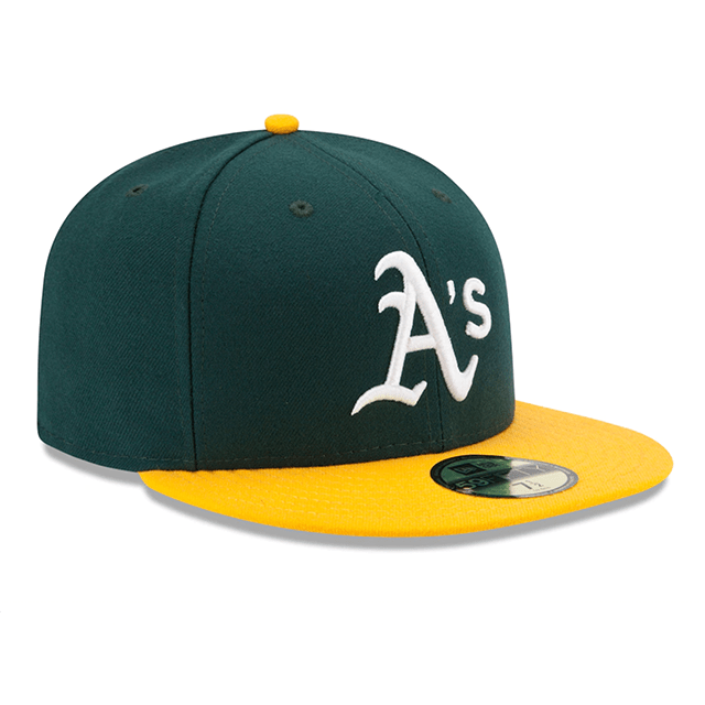
04 – Oakland Athletics – Two tone hat, and an A with an apostrophe? The fuck, so cool, so iconic. This hat has transcended the team in a good way. Between Moneyball and just the slick look of the hat it belongs in the top 5.
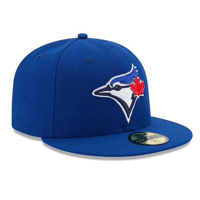
03 – Toronto Blue Jays – Look most teams don’t have their logo on their hat, the Jays said fuck it we know how cool this bird looks lets ride with it. The color is perfect, and in a league where everyone’s hat has letters it’s important to stand out.
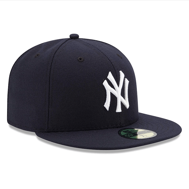
02 – New York Yankees – This hat transcends the team. The NY cap for the Yankees is a symbol for the city, and more importantly after 9/11 became a sign of freedom, and the American way. Every player worth his salt has worn it, and it never goes out of style.
01 – Los Angeles Dodgers – The blue, the simple LA, the fact that Christopher Loyd’s character in Angels in the outfield switched it to AL. It’s iconic, it’s simple, it’s perfect. So perfect that others have copied and fallen short. Clearly the best hat in baseball.

